GoPro Hero 11 Black Mini

Crafting a full-featured camera experience on a screen the size of a postage stamp.

Company

GoPro

Expertise

Product Design / Motion

Industry

Consumer Hardware

Platform(s)

Hardware ‹› Firmware

GoPro Hero 11 Black Mini

Crafting a full-featured camera experience on a screen the size of a postage stamp.

Company

GoPro

Expertise

Product Design / Motion

Industry

Consumer Hardware

Platform(s)

Hardware ‹› Firmware

GoPro needed to launch the Hero 11 Black Mini, a new camera that stripped away the touchscreen to achieve a smaller, more durable form factor. The core challenge was to design a full-featured, intuitive user experience on a tiny 72x32px screen, controlled by only two hardware buttons.

As the Lead UX Designer, I was responsible for the entire hardware and software user experience, from the on-device firmware UI to its connection with the mobile app.

Hardware controls

"Kevin exhibits a profound sense of aesthetics and interaction practices, which are deftly employed in all of his product development initiatives, imparting mass appeal to the overall user experience. With a discerning eye for detail and commitment to excellence, Kevin consistently pushes the limits of product development, while simultaneously driving the process forward, unearthing numerous avenues for enhancing team dynamics and business efficacy. In short, Kevin is a valuable asset to the world of product development, and his contributions to GoPro and the field of UX are elevated having worked with him."

Senior Principal Designer, Cameras & Hardware, GoPro
The Visual System: Designing for Brutal Constraints

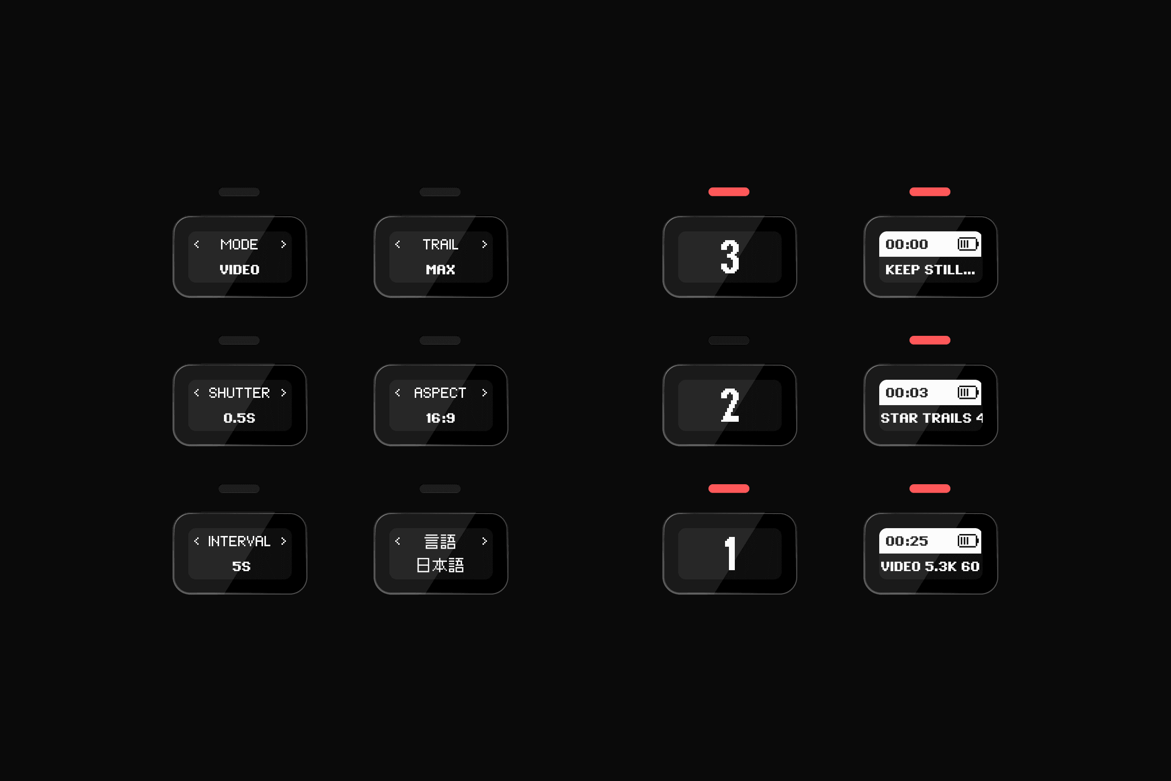
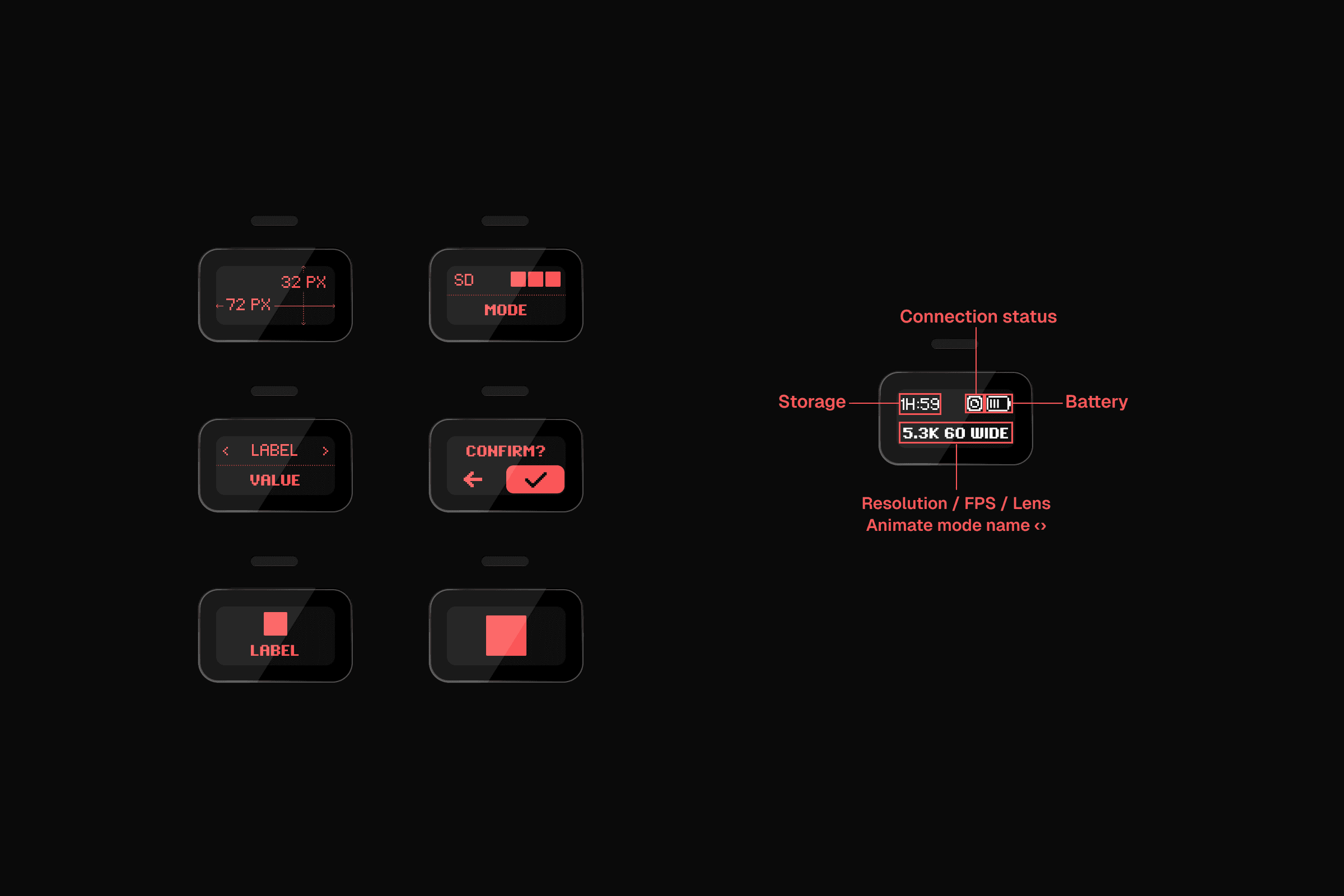
With no touchscreen, a minuscule two-color, 8-bit display, and only two hardware buttons, the entire visual system had to be built for maximum legibility and simplicity. Every single pixel mattered.

The system was comprised of a pixel fonts across 11 languages, a complete set of 8-bit icons for all camera functions, and simple animation patterns to provide clear feedback. The goal was to create a high-contrast, glanceable interface that a user could navigate with physical buttons without ever taking off their gloves.

CORE SCREENS

IDLE SCREEM

The Execution: A Two-Button Experience

The On-Screen UI

Here is how the visual system was applied to create a seamless experience, allowing users to navigate complex settings and modes with just two buttons. The on-device UI was designed to work in concert with the Quik mobile app for more advanced controls.

Boot ANimation

Default/Idle

Confirmation

IDLE SCREENS

Confirmation SCREENS

Settings

REcording/encoding

Details your thing? Check out some daigrams

Details your thing? Check out some daigrams

The On-Device Feedback System

With such a minimal screen, the on-device audio and LED feedback was just as important as the on-screen UI. I designed a complete system of beeps and blinking patterns that corresponded to every user action—from powering on and recording to changing modes. This non-visual feedback was critical for users operating the camera while mounted on a helmet or out of sight.

The Outcome

Successfully launched a new flagship hardware product for a global, market-leading brand.

Created an intuitive and critically praised user experience that delivered the full power of a GoPro despite extreme hardware constraints.

Validated a new, more compact, and durable form factor for the GoPro camera ecosystem.

Your project starts today.

30-minute intro call. No proposal required.

Bend, Oregon

·

20:40 AM

Your project starts today.

30-minute intro call. No proposal required.

Bend, Oregon

·

20:40 AM

Your project starts today.

30-minute intro call. No proposal required.